节点编辑对话框
节点的编辑对话框是用户配置节点以实现其所需功能的主要方式。
该对话框应直观易用,并与其他节点保持设计和外观上的一致性。
编辑对话框在节点的HTML文件中提供,位于一个<script>标签内。
<script type="text/html" data-template-name="node-type">
    <!-- edit dialog content  -->
</script>
<script>标签的type应为text/html——这将有助于大多数文本编辑器提供正确的语法高亮。它还可以防止浏览器在节点加载到编辑器时将其视为普通的HTML内容。- 该标签的
data-template-name应设置为其所对应的节点类型。编辑器通过此属性来识别在编辑特定节点时应显示的内容。
编辑对话框通常由一系列行组成——每行包含一个标签和一个用于不同属性的输入框。
<div class="form-row">
    <label for="node-input-name"><i class="fa fa-tag"></i> Name</label>
    <input type="text" id="node-input-name" placeholder="Name">
</div>
- 每行都由一个带有类
form-row的<div>创建。 - 典型的行将包含一个带有图标和属性名称的
<label>,后跟一个<input>。图标使用<i>元素创建,其类取自Font Awesome 4.7中可用的图标。 - 包含属性的表单元素必须具有ID:
node-input-<propertyname>。对于配置节点,ID必须是node-config-input-<property-name>。 <input>的类型可以是text(用于字符串/数字属性),也可以是checkbox(用于布尔属性)。此外,如果有一组受限的选择,可以使用<select>元素。
Node-RED提供了一些标准的UI小部件,节点可以使用它们来创建更丰富、更一致的用户体验。
按钮
要在编辑对话框中添加按钮,请使用标准的<button> HTML元素并为其指定类red-ui-button。
普通按钮 |
<button type="button" class="red-ui-button">Button</button> |
小按钮 |
<button type="button" class="red-ui-button red-ui-button-small">Button</button> |
切换按钮组 |
<span class="button-group">
<button type="button" class="red-ui-button toggle selected my-button-group">b1</button><button type="button" class="red-ui-button toggle my-button-group">b2</button><button type="button" class="red-ui-button toggle my-button-group">b3</button>
</span>
HTML $(".my-button-group").on("click", function() {
$(".my-button-group").removeClass("selected");
$(this).addClass("selected");
})
oneditprepare 要在活动按钮上切换 注意:请避免在 |
输入
对于简单的文本输入,可以使用标准的<input>元素。
在某些情况下,Node-RED提供TypedInput小部件作为替代方案。它允许用户指定属性的类型及其值。
例如,如果一个属性可以是字符串、数字或布尔值。或者如果该属性用于标识消息、流或全局上下文属性。
它是一个jQuery小部件,需要将代码添加到节点的oneditprepare函数中才能将其添加到页面。
有关TypedInput小部件的完整API文档,包括可用内置类型列表,可在此处查看。
普通HTML输入 |
<input type="text" id="node-input-name"> |
TypedInput
|
<input type="text" id="node-input-example1">
<input type="hidden" id="node-input-example1-type">
HTML $("#node-input-example1").typedInput({
type:"str",
types:["str","num","bool"],
typeField: "#node-input-example1-type"
})
oneditprepare 当TypedInput可以设置为多种类型时,需要一个额外的节点属性来存储类型信息。这作为隐藏的<input>添加到编辑对话框中。 |
TypedInput
|
<input type="text" id="node-input-example2"> HTML $("#node-input-example2").typedInput({
type:"json",
types:["json"]
})
oneditprepare JSON类型包含一个按钮,该按钮将打开一个专用的JSON编辑对话框(在此演示中已禁用)。 |
TypedInput
|
<input type="text" id="node-input-example3">
<input type="hidden" id="node-input-example3-type">
HTML $("#node-input-example3").typedInput({
type:"msg",
types:["msg", "flow","global"],
typeField: "#node-input-example3-type"
})
oneditprepare |
TypedInput
|
<input type="text" id="node-input-example4"> HTML $("#node-input-example4").typedInput({
types: [
{
value: "fruit",
options: [
{ value: "apple", label: "Apple"},
{ value: "banana", label: "Banana"},
{ value: "cherry", label: "Cherry"},
]
}
]
})
oneditprepare |
TypedInput
|
<input type="text" id="node-input-example5"> HTML $("#node-input-example5").typedInput({
types: [
{
value: "fruit",
multiple: "true",
options: [
{ value: "apple", label: "Apple"},
{ value: "banana", label: "Banana"},
{ value: "cherry", label: "Cherry"},
]
}
]
})
oneditprepare 多选的最终值是选中选项的逗号分隔列表。
|
多行文本编辑器
Node-RED包含一个基于Ace代码编辑器的多行文本编辑器,如果通过用户设置启用,则为Monaco编辑器。
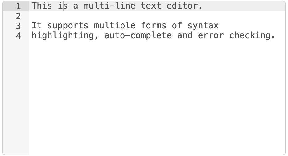
多行文本编辑器
在以下示例中,我们将编辑的节点属性名为exampleText。
在您的HTML中,为编辑器添加一个<div>占位符。这必须具有CSS类node-text-editor。您还需要为该元素设置一个height。
<div style="height: 250px; min-height:150px;" class="node-text-editor" id="node-input-example-editor"></div>
在节点的oneditprepare函数中,文本编辑器使用RED.editor.createEditor函数进行初始化。
this.editor = RED.editor.createEditor({
   id: 'node-input-example-editor',
   mode: 'ace/mode/text',
   value: this.exampleText
});
还需要oneditsave和oneditcancel函数,以便在对话框关闭时从编辑器获取值,并确保编辑器已正确从页面中移除。
oneditsave: function() {
    this.exampleText = this.editor.getValue();
    this.editor.destroy();
    delete this.editor;
},
oneditcancel: function() {
    this.editor.destroy();
    delete this.editor;
},